
What you should avoid for a smooth process
On your external store, never duplicate a product created by TPOP: it would not be recognized by our system if a customer orders it from you.
Do not delete or modify the "SKUs".
Do not modify or delete the created variants (size / color), nor reverse the options (do not place size where color should be and vice versa).
Do not change the product type or the "Distributor" - "Vendor".
Do not mark your orders as processed: we will do it automatically. If you process your orders, we will not be able to update the tracking number for your customers, and you will not be able to cancel an order from our dashboard.
Do not remove a product from your shop that has been ordered until it is shipped: this may cause production issues.
If you manually place orders from an external CMS, make sure to select the destination country (this is often forgotten): if not, you will be charged the most expensive rate, that of a worldwide delivery.
We will not be able to correct this billing once the order is in production, and we will not be able to offer a refund (the operation is time-consuming and labor-intensive). We strongly advise you, for manual orders, to use the creation module of the platform, which will avoid the fees sometimes associated with these external CMS.
What to avoid for top-quality printing
The Semi-Transparency
For your designs intended for printing on textiles, it is essential to avoid including semi-transparent areas or shading effects.
Your design is first printed on a film, then covered with a heat-activated adhesive powder before being transferred onto the textile. To accurately reproduce colors, especially on dark clothing, a white ink underlayer is printed beneath the colored areas of the design.
This underlayer is precisely what makes semi-transparent pixels problematic. On your screen, a shadow, a glow, or a border at 30 or 50% opacity blends with the color behind it and appears perfectly natural. During DTF printing, this behavior cannot be reproduced in the same way: these pixels may receive white ink and adhesive, causing halos, whitish borders, or grayish areas on the textile that were not visible on the screen.
Example: On the left, the design as it appears on the screen with its semi-transparent areas; on the right, the result after DTF printing, where these areas may cause halos and unwanted borders on the textile.
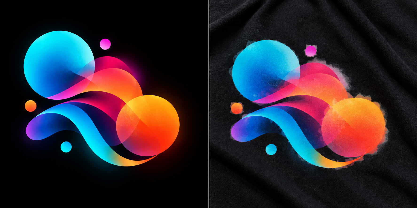
All visible parts of your file must therefore be at 100% opacity or completely transparent.
Note: This does not mean gradients are prohibited. You can perfectly use a gradient from blue to violet, from yellow to orange, etc., as long as all colors remain at 100% opacity. It is the gradients toward transparency, semi-transparent shadows, glow effects, progressive borders, and low-opacity brush strokes that you should avoid.
To achieve a shadow or blending effect anyway, you can create it using opaque colors or, for some designs, with a screen of 100% opaque dots whose spacing visually simulates transparency. This is the principle of the screen (or halftone).
Image Quality
The higher the resolution of your image, the more detailed your product will be.
Regarding the dimensions of your visuals, ensure you send images with a minimum width of 2000 pixels (and a maximum of 5000 pixels), at 150 DPI: the result will be excellent.
However, even though our printers allow for a very precise reproduction of your visuals, textiles are less defined than paper: micro-details may not appear correctly, keep this in mind before sending your visuals.
Fluorescent Colors
Regardless of the support, fluorescent colors should be avoided: fluorescent rendering is not printable.
If you send a file with integrated fluorescent colors, we will print with the closest possible match. The same applies to all special colors (gold, silver, mirror effect, etc.).